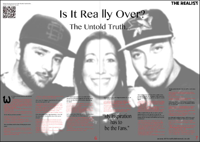
This was my first change. I blurred out the image and place the text over the image, so it looked like a water mark, however i didn't like the appearance as it looks unstructured and messy creating a non professional DPS. I found that the social media sites also made my page tacky and is not a traditional theme on DPS in music magazines.
Due to my first outcome, I decided to remove the social media account logos and make the page really simple. I placed the text on the clothing of my models, so it didn't conflict with the beauty of the photo of the artists. I still kept the QR code as this was an easier way of getting the consumers to go onto the website and view the official interview recording.
However I did like the signatures that i had on the photo as shown in my previous posts (as shown bellow):
So I will try and find a way of placing this in my DPS as I think it's a nice touch.


thanks!
ReplyDeleteGBU
amygdala